Pops in the Park
Goals:
Create a logo that weaves into yearly iterations of the poster seamlessly
Gain a full understanding of how agencies use their design process
Make something cool
Challenges:
Establishing a new normal for local music festival branding
Collaborating with seasoned design professionals to create something we all love
Client
Springfield Art Museum
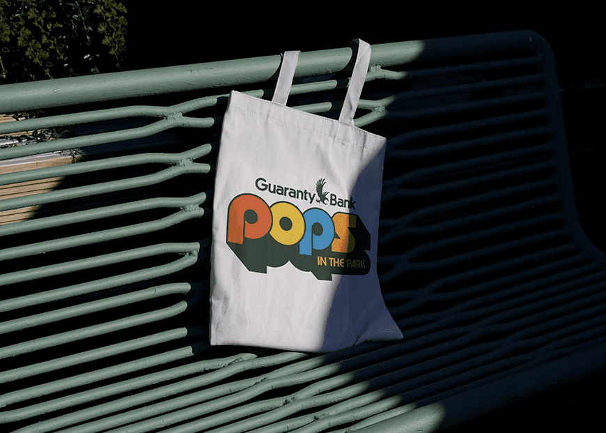
Deliverables
Brand Identity
Poster
Year
2025
Role
All True—
Brand Design Intern

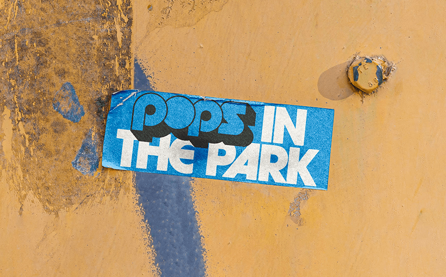
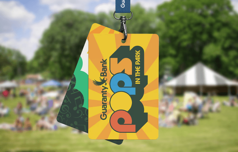
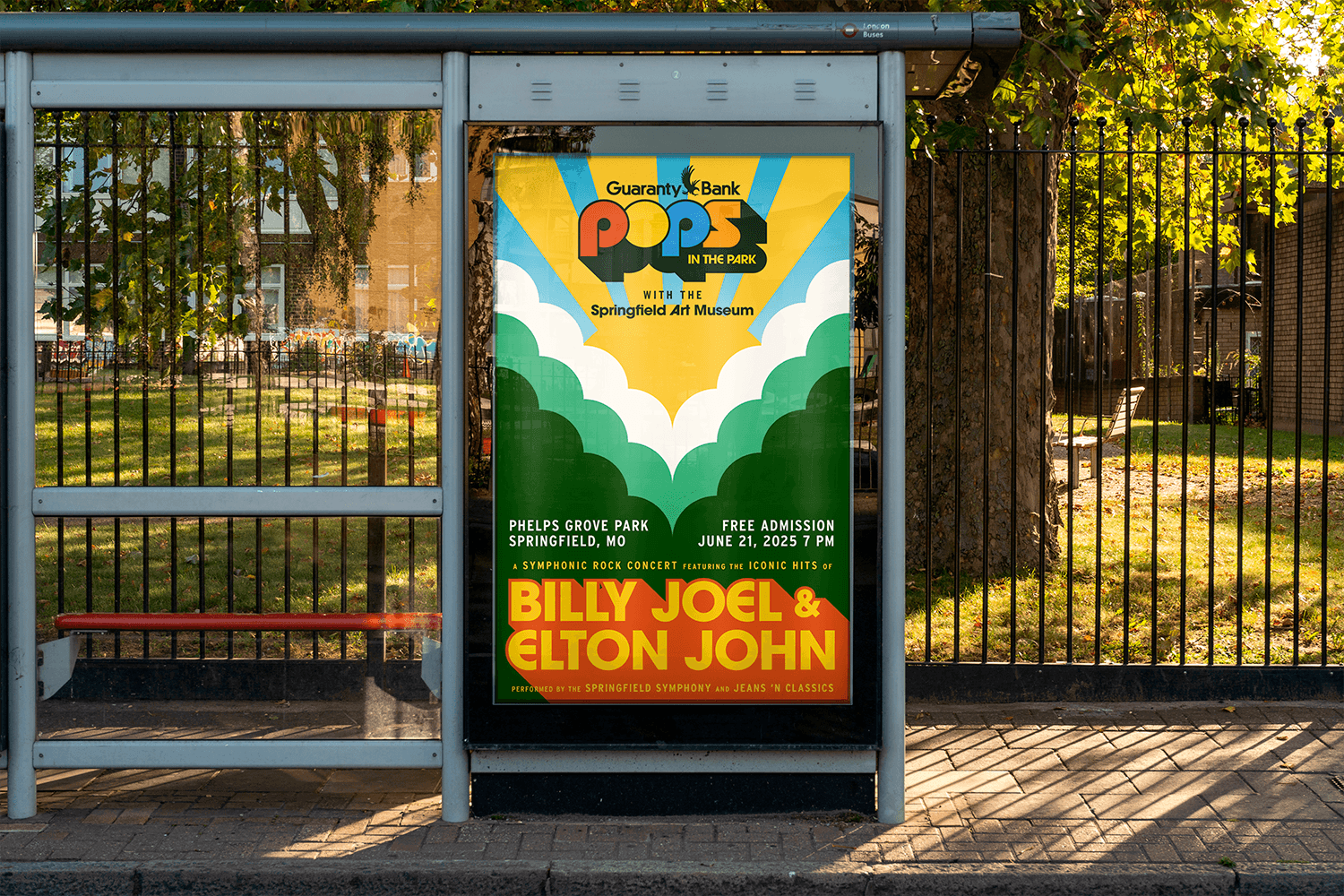
Our goal was to create a new logo and foundation pieces for Pops in the Park’s visual identity and the artwork for 2025’s Pops in the Park posters with key collateral. The visual identity and annual design should work in tandem and act as a foundation for future iterations.
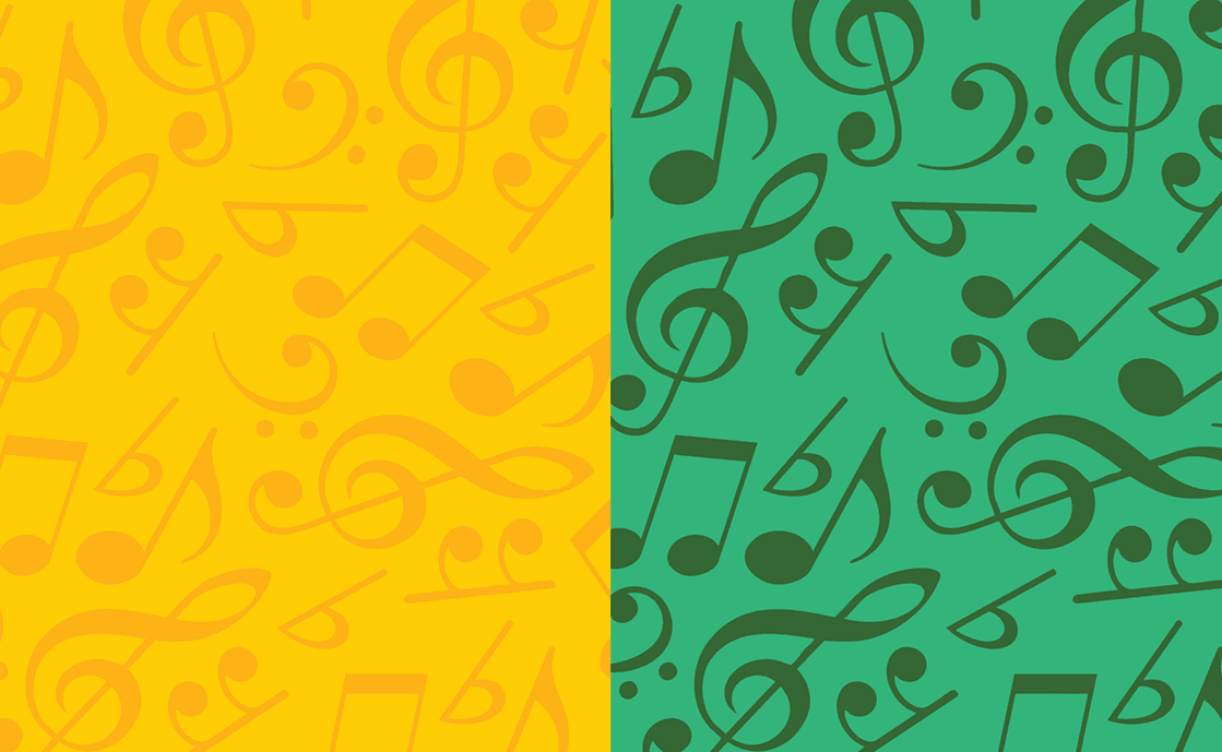
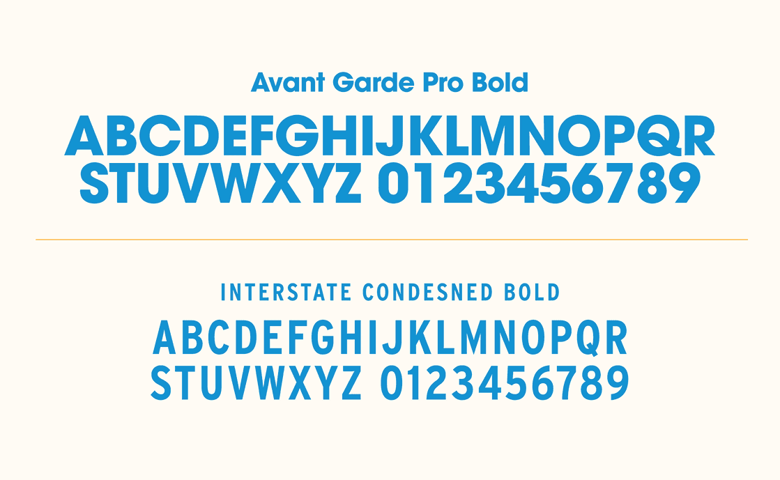
The logo for Pops in the Park is simple, distinct, and memorable. In support of this key visual identity component, we defined a set of colors and Avante-Garde typography for the brand. The artwork for the poster and promotional assets takes inspiration from Aaron Draplin and features dynamic, ascending patterns with a retro POP of color.